Project
Updating the identity of a university founded in 1240, inside eight centuries of iconography: a rationalised seal for today's channels and an open design system, built with LCD Studio.
Rebranding the University of Siena
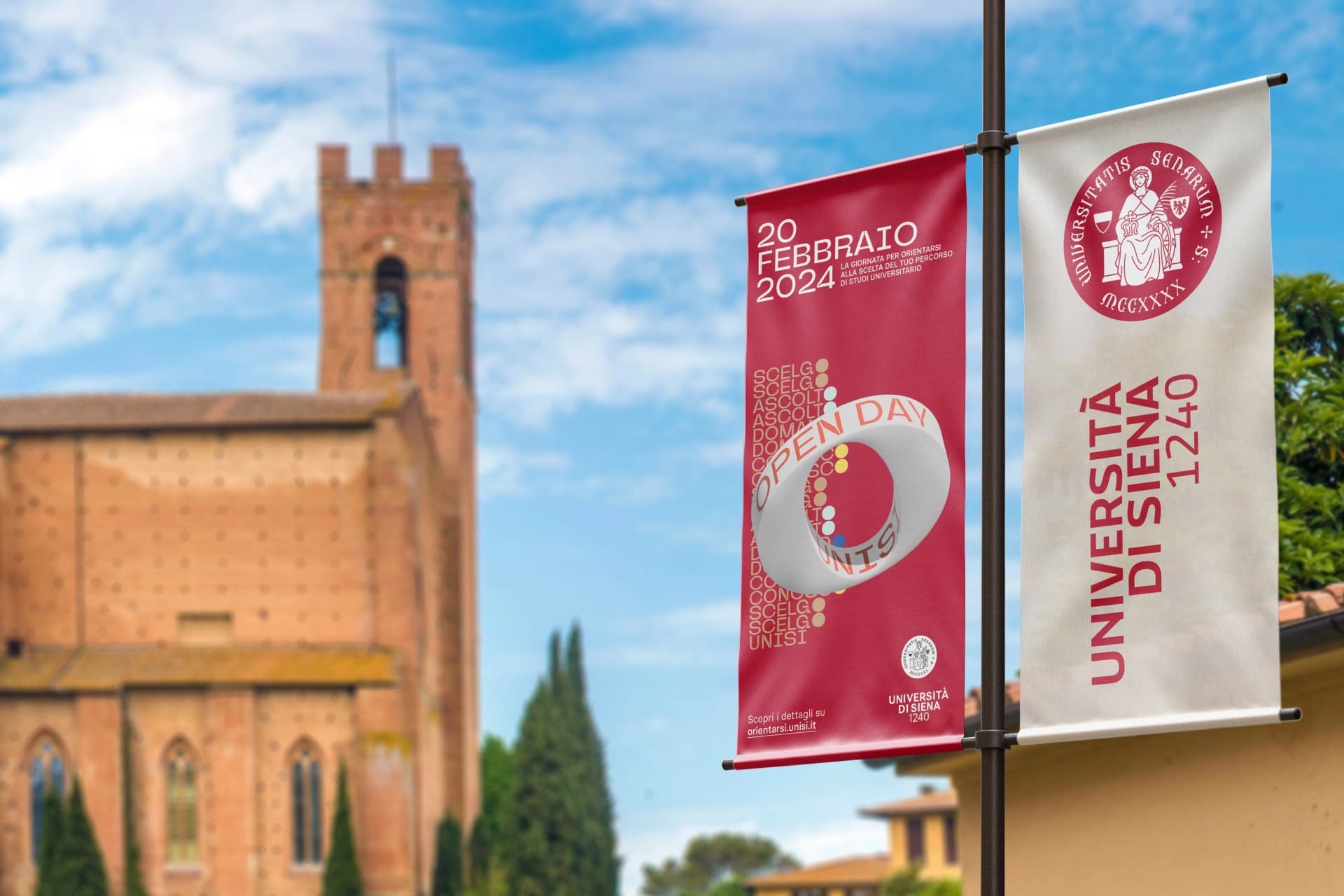
- Client
- University of Siena
- Area
- Identity
- Year
- 2024
- Main link
- See the 2024 brandbook
How do you update the visual identity of a public university founded in 1240? In 2024 Dinamo, with LCD Studio of Florence, worked with the University of Siena on a deep rebranding within a wider programme reorganising its communication, online and offline. The project brings together historical and philological research, organisational listening and a systems view.
The starting point is a rare inheritance, and one that places a heavy responsibility on whoever carries the project out: the Siena university is among the ten oldest in the world and its image has been tied for centuries to Saint Catherine of Alexandria. The work therefore moves in the space between conservation and transformation: engaging with the weight of that tradition and answering the needs of communication today, made of many media and many contexts.
Rather than fixing a definitive image, building a stable and open framework, able to take on adaptations without losing recognisability.
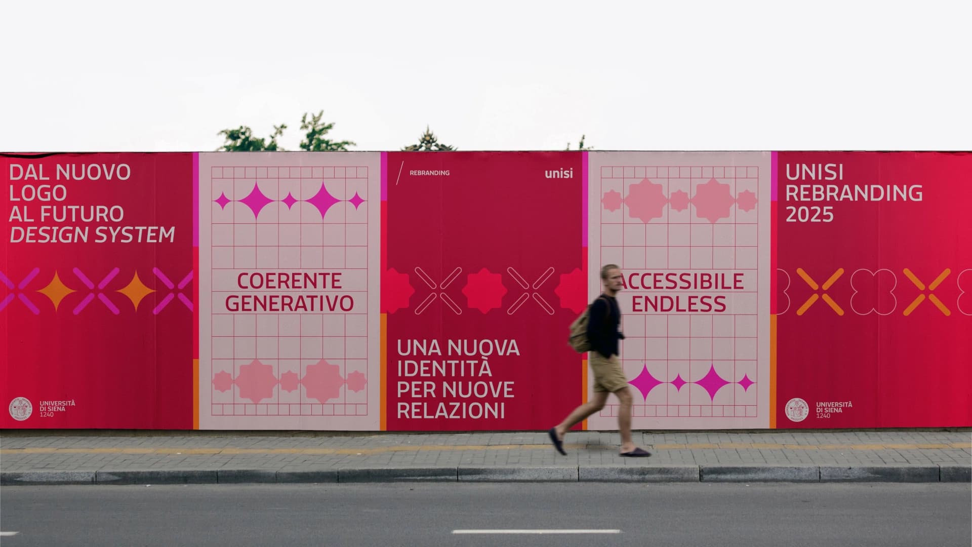
The University brings together students, academics, researchers, staff, citizens and stakeholders. Over time that richness had settled into a heterogeneous system of marks and practices, putting recognisability at risk. The Rector therefore promoted a deep rebranding, developed through meetings, interviews and workshops with the people responsible for institutional communication.
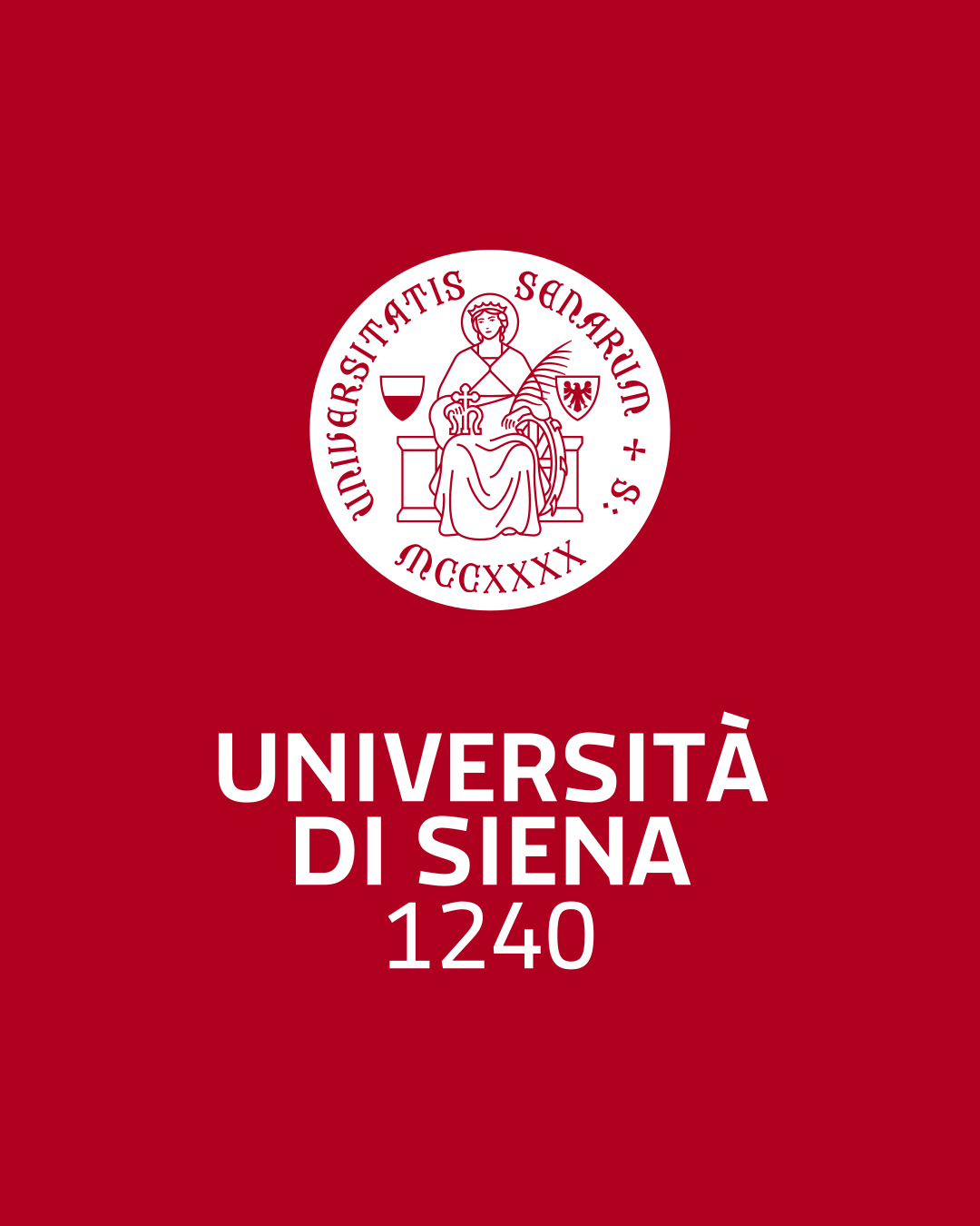
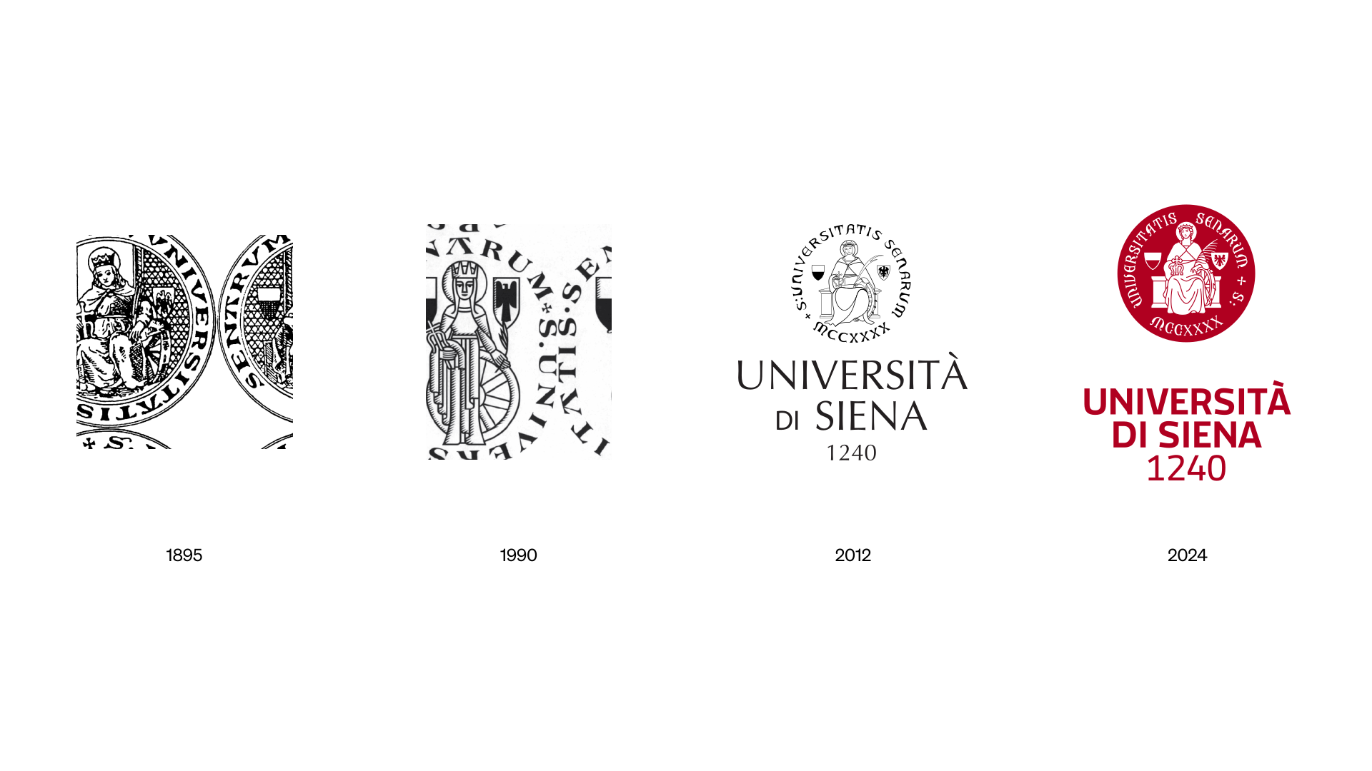
The University's identity has been tied to Saint Catherine of Alexandria, patron of studies, since the bronze seal of the fourteenth century.
Since then her figure has run through centuries of representations, from the Beadle's mace of 1440 to Alessandro Franchi's seal of 1896, from Massimo Dolcini's reinterpretation of 1990 to the philological version of 2012.
Each step sought a balance between fidelity to heraldic tradition and legibility. The 2024 rebranding continues that line, taking as its reference the philological research begun in 2011.
Redesigning the seal
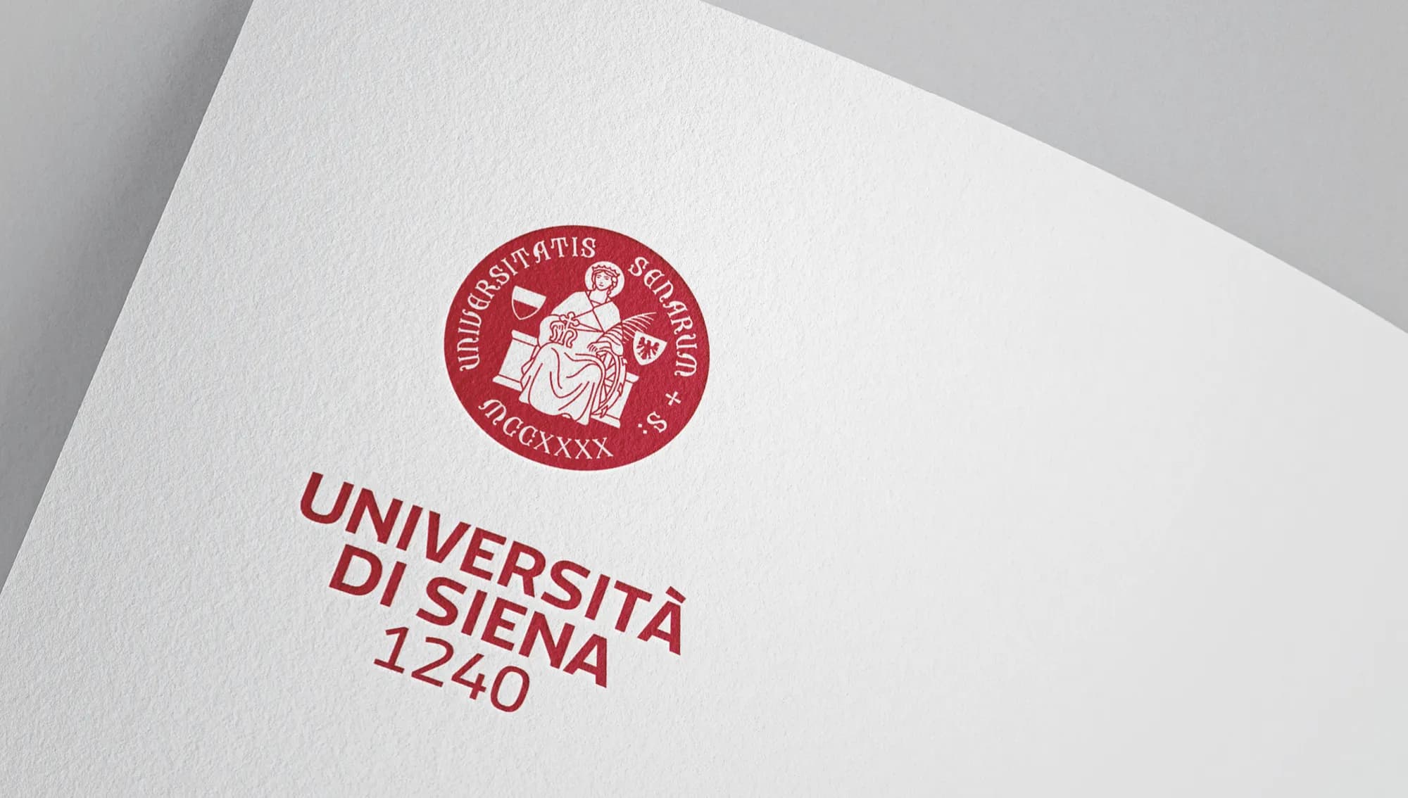
On the seal the intervention is one of rationalisation. Staying faithful to the visual syncretism defined in 2011, the redesign works on legibility, formal coherence and reproducibility across different contexts of use. Adopting a uniform stroke weight reduces perceptual ambiguity and gives the whole its clarity back.
The legend was redrawn from the neo-Gothic architectural lettering of the Rectorate building (1892): from that model comes a dedicated digital typeface, Unisi Regular. For the logotype the choice was Macho Modular by the Italian foundry Cast, for its wide range of weights and its flexibility in application.
The system: coherence within flexibility
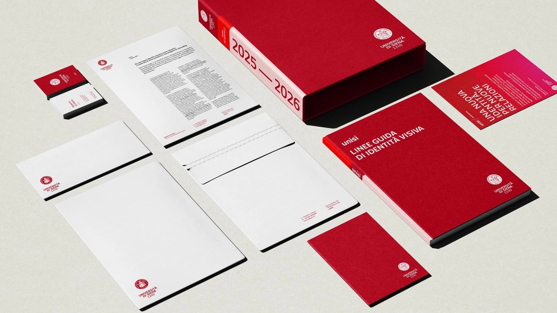
Around the logo a system takes shape that holds uniformity and versatility together. The only deliberate departure from tradition is chromatic: an institutional colour code built on a red drawn from Siena earth (the "Rosso Unisi") for its direct association with the place. To this are added a typographic system that joins authority and clarity, modular components for posters, social, signage, web and merchandise, and customisable guidelines and templates. Four principles guide the system: people at the centre, simplification, accessibility, continuous evolution.
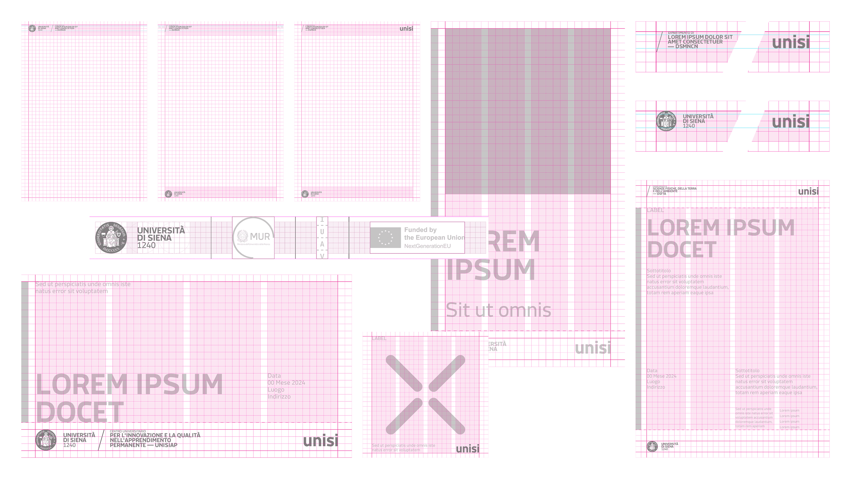
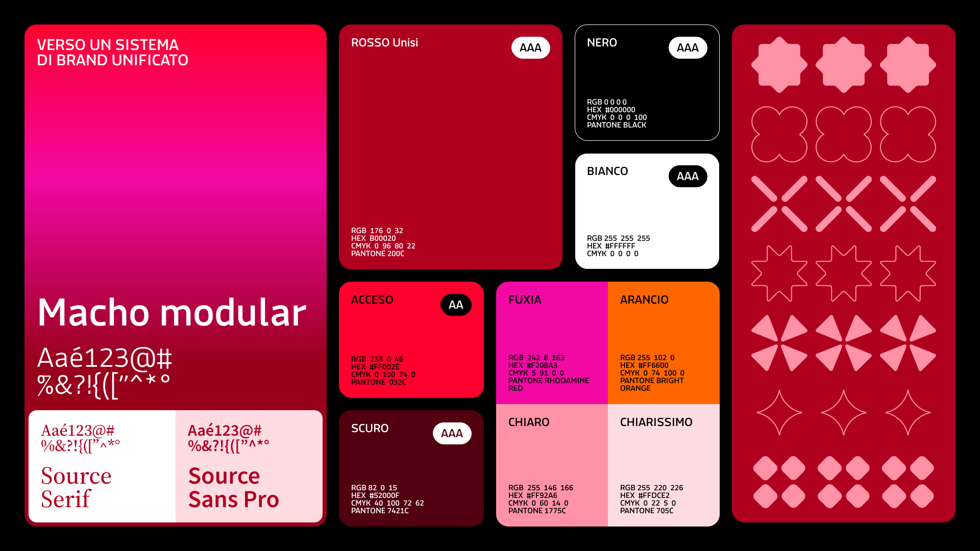
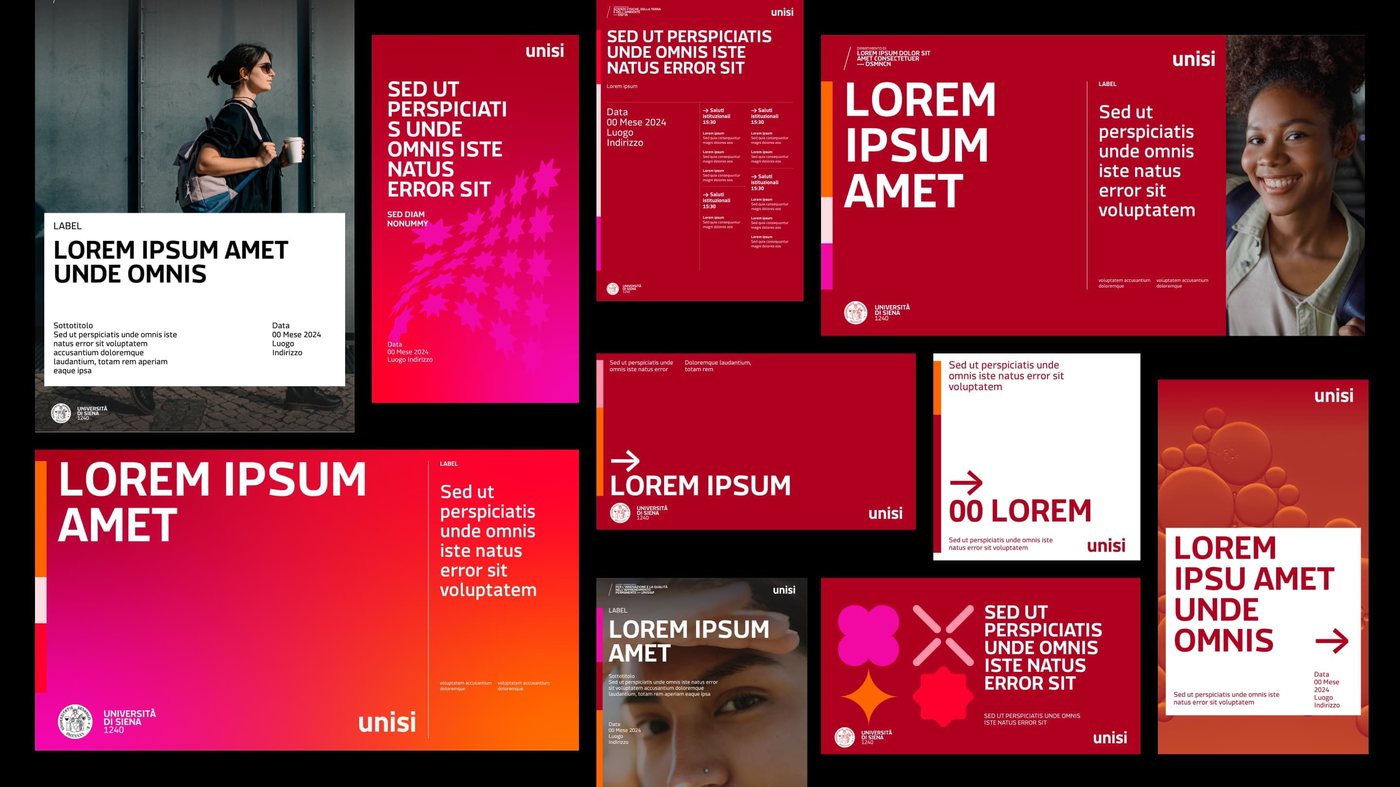
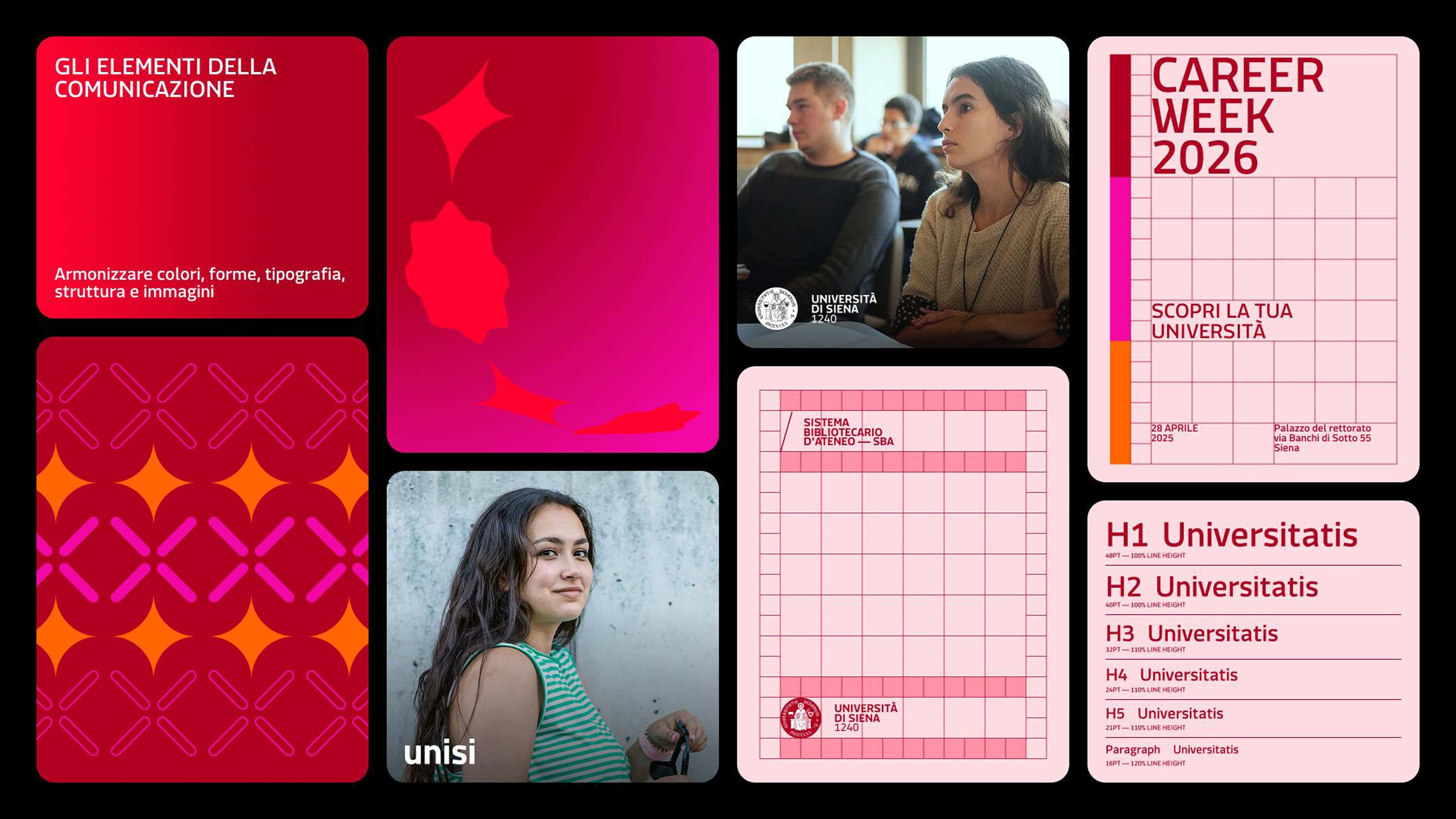
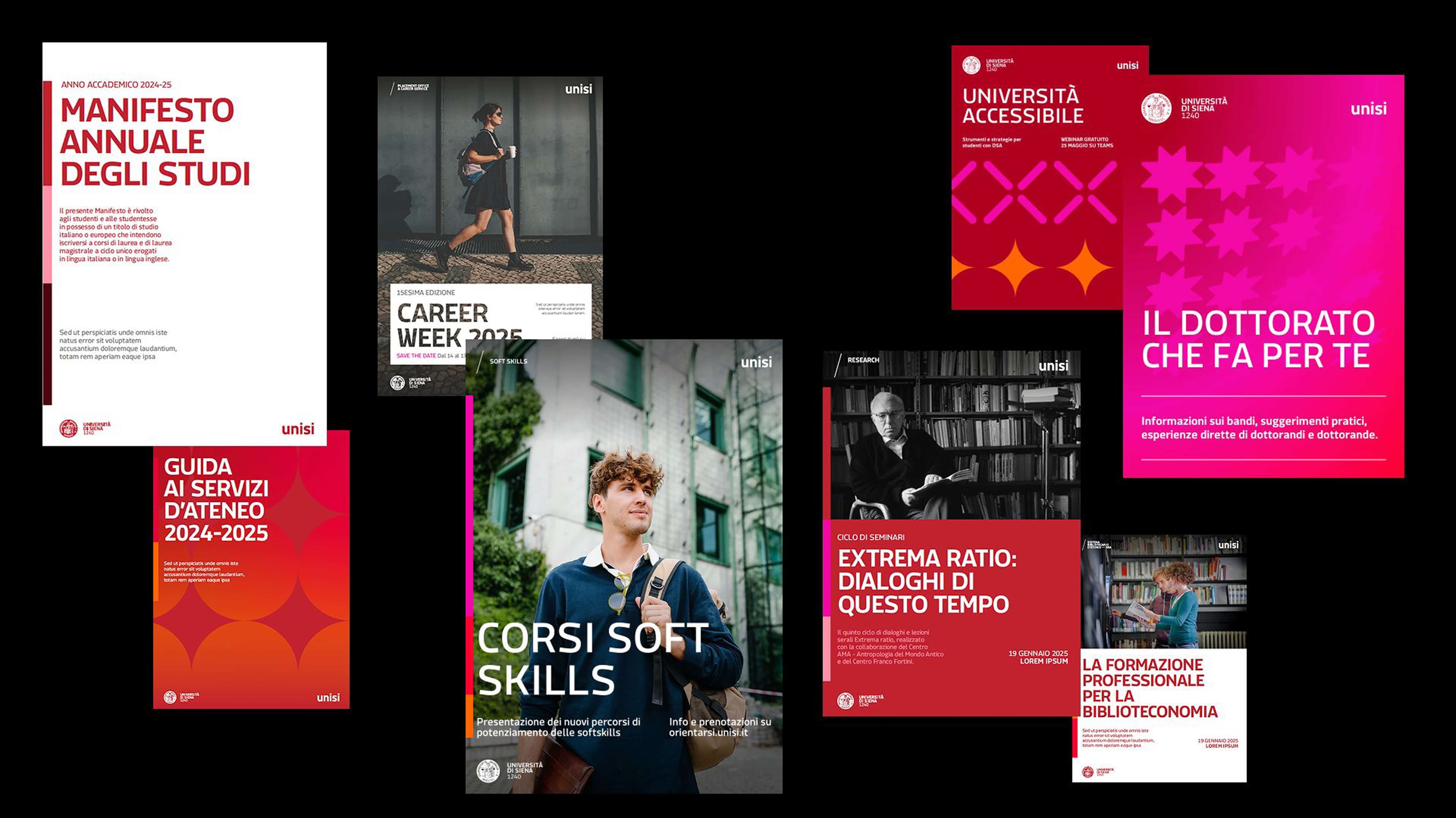
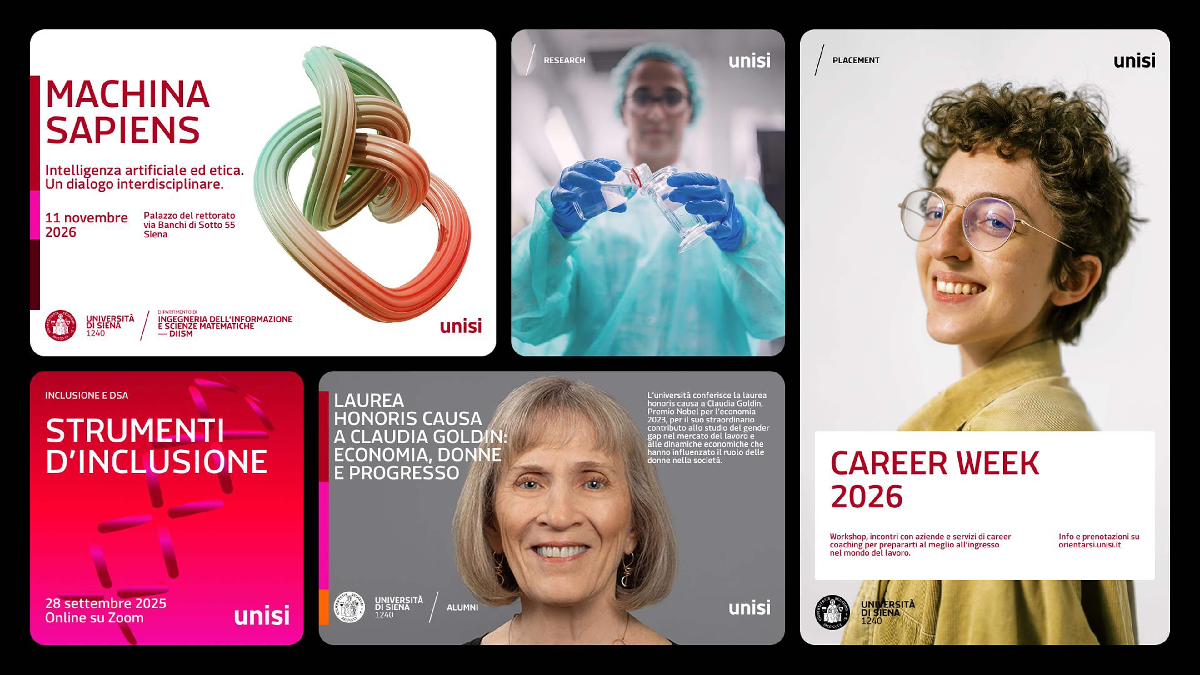
The design system is an initial core, designed to evolve with the contribution of the university community. The guidelines work as an instrument of dialogue between the different actors in communication, rather than as a constraint. It is a framework built to accompany the University's evolution over time without losing recognisability.